What’s wrong with using Web screenfonts for captions and subtitles?
We already have a small collection of fonts custom-engineered for onscreen display. The best-known are Georgia and Verdana, designed by Matthew Carter for Microsoft. Tahoma and Nina (also by Carter); Trebuchet by Vincent Connare; and Vera by Jim Lyles are further examples among many. Because of careful hinting and special adaptation for computer displays, these screenfonts are generally more pleasant and easier to read than many other fonts.
But their purpose is to display static pages of text. In this case, “static” can also refer to certain kinds of “dynamic content,” like editing a word-processing document or typing up a blog entry. Nonetheless, the words you are typesetting in these fonts usually just sit there until you edit them or manually scroll the window. They don’t appear and disappear like pop-on captions or subtitles, nor do they scroll or paint on like certain other captions. You don’t have a single nominal chance to read the text that uses those fonts before that text disappears.
Moreover, Verdana in particular was designed mostly around spacing rather than around characters. The spaces between characters were given considerable attention. Verdana’s character shapes are somewhat exaggerated to overcome the limitations of really crappy computer displays; Verdana’s x-height is also quite large.
You’ve probably seen Verdana printed out, particularly at large sizes (in posters for yard sales and the like). It’s perfectly readable, but it looks a bit strange in a use case like print, which differs considerably from onscreen display. As it turns out, DVD subpictures are another use case where Verdana falls down. Even with Verdana’s custom-designed italic, the low resolution and jagged edges of subpicture fonts make the already-wide characters look even cruder.
(The jaggies come from the fact that DVD subpictures give you four colours to play with, but only two are really practicable for subtitles and captions. And few fonts, let alone captioning and subtitling software packages, attempt to use the second colour to anti-alias the typeface contours.)
Examples from Modern Times
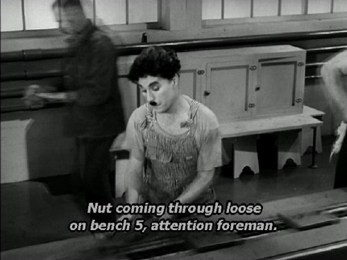
Let’s look at some examples from Chaplin’s Modern Times, captioned and subtitled by TVS—Titra in Paris.
This application appears to use both the readily-available DVD subpicture colours – white for type and black for a shadow around and behind each individual letter (following all the contours, not a rectangular block like Line 21 captions). This unsubtle usage of black and white actually worsens the unsuitability of Verdana.
-
- Already we can see that the curves of the S are too subtle for the resolution we’re using. Moreover, can you spot the copy errors?
-
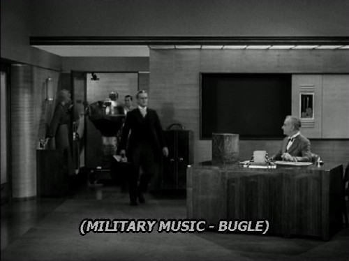
- Please don’t typeset captions in all-capitals, especially not for non-speech information, which is supposed to be less important than speech transcription. (SDI does the same thing in its Line 21 captions.) The black shadow emphasizes the jaggies in this implementation of Verdana, and that’s a regular hyphen they’re using instead of the correct en dash.
-
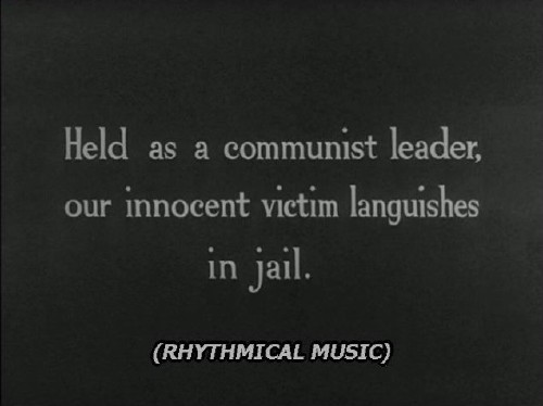
- You can see the difference in resolution between film – even a film that’s 80 years old – and subpictures, even though both are using the DVD medium. The type in this intertitle is actually hand-lettered; the all-caps Verdana Italic really clashes here, though this is not an argument for selecting caption fonts so they look just like intertitles.
-
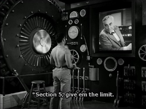
- Apart from the fact that captions aren’t supposed to begin with asterisks, and “give ’em” is two words, not one (give'em), we can see that the black background/shadow tends to fill in the counters (of the e and g especially). The particular size chosen has caused the vertical strokes of i, t, and l to have different widths, which is one argument for custom-tuned bitmaps in DVD subpictures.
Version history
- 2005.03.07
- Posted.
Navigation
You were here: Screenfont.ca → Fonts → Today’s fonts →
What’s wrong with using Web screenfonts for captions and subtitles?