Problems in software rendering of Line 21 captions
Since the Line 21 captioning spec is older than Duran Duran, you’d think it would be a simple thing to implement in software. Apparently not.
While several software-based players – ATV video-card software; Microsoft Media Center computers – provide easy access to captions, a prominent example of doing things wrong is the DVD Player application in Mac OS X 10.3 and later. (It’s also the only one for which we have screenshots.)
Some reference illustrations are available from the ATypI Vancouver presentation on caption and subtitle typography. Use those images as a comparison in the following discussion.
Alignment
DVD Player cannot get the alignment right. In part this is due to Apple’s insistence on using a proportionally-spaced font (Lucida Grande), a well-intentioned, but sadly quite incorrect, prettying-up of the primitive 1979-era Line 21 spec. Line 21 captions are monospaced.
![‘South Park,’ correctly: [ Imitates Dying Giraffe ]](http://joeclark.org/axxlog/images/SouthParkDyingGiraffe.jpg)
![‘South Park,’ incorrectly: [ Imitates Dying Giraffe ]](http://joeclark.org/axxlog/images/DVDPlayerSPOhShit.jpg)
Captions, Inc.’s carefully-wrought hanging punctuation becomes carelessly-wrecked hanging punctuation in DVD Player:
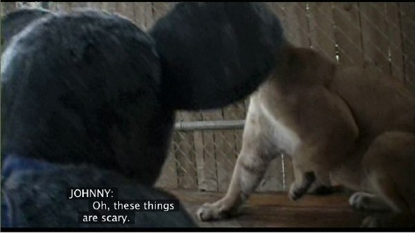
More alignment problems? How about Gattaca?
![‘Gattaca,’ correctly: [ Man ]: WELL, I THINK WE CAN RULE OUT SUICIDE. ¶ [ Man #2 ] EXCLUSE ME, SIR?](http://joeclark.org/axxlog/images/Gattaca%5BMan%5D%5BMan%232%5D.jpg)
![‘Gattaca,’ incorrectly: [ Man ]: WELL, I THINK WE CAN RULE OUT SUICIDE. ¶ [ Man #2 ] EXCLUSE ME, SIR?](http://joeclark.org/axxlog/images/DVDPlayerGattacaSuicide.jpg)
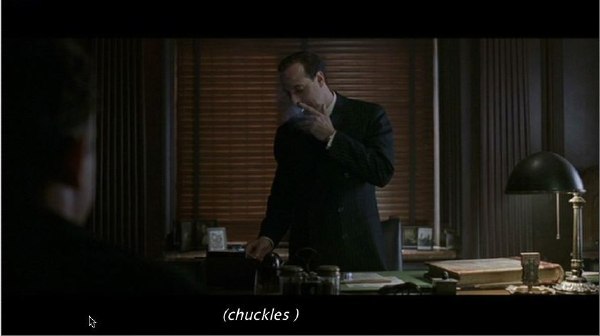
Another issue – not quite font-related, but vaguely important if our aim is to create captions for people to read – is that DVD Player has poor technical performance. It simply fails to display many captions, particularly if they move quickly. Further, its display of pop-on captions is not really correct: The entire caption is supposed to appear instantaneously, whereas DVD Player does something akin to the paint-on style. You can see the caption forming. And some captions are simply mangled.

In fact, the very simplest alignment possible, flush left, is well beyond the abilities of DVD Player:
Typography
Backgrounds
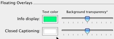
The character background is translucent. A nice prettying-up, certainly, but contrary to the EIA-608 spec, which requires black backgrounds by default. (Other backgrounds may optionally be provided.)
DVD Player preferences let you select the foreground colour and degree of transparency, however. Certainly a nice feature, but the program should default to the spec.
Italics
Italic handling is terrible. To turn the following on or off within a row –
- italics (technically, they are obliques)
- underlining
- blinking
- colour
- any combination of the above
– you must send a control code that produces a visible space. The Caption Center’s technique of using lower-case italics within parentheses obliges them to set a space inside the parens. It doesn’t look so bad even if it violates English orthography, meaning it must someday be eliminated.
DVD Player, however, deletes the first blank space (the italic-on code), retains the last one, and apparently italicizes the whole line, or at least it starts italics one character to the left of where they are commanded to begin.
Let’s do a simple comparison, from Road to Perdition:
It looks even worse with a descending italic capital J.
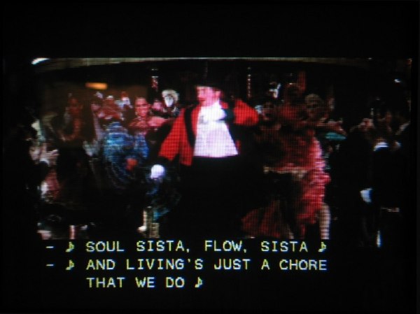
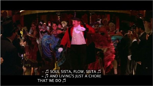
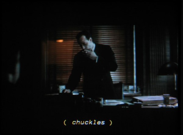
Staffnotes: ♪ vs. ♫
DVD Player gets an extremely important glyph wrong. The staffnote character, ♪, is misrendered as some kind of double staffnote, ♫. Its true nature is an eighth note, Unicode U+266A EIGHTH NOTE, rather than DVD Player’s prettied-up and entirely incorrect U+266B BARRED EIGHTH NOTES. This error is akin to replacing every neutral apostrophe with neutral double quotes.
Things worsen in the case of some captioners’ peccadillo of ending songs with double staffnotes, which suddenly morph into double barred staffnotes. The rendering becomes long enough to actually be played on a piano if you can read music.
Offscreen display
DVD Player lets you activate something we’ve been calling for since 1989: Offscreen display.
Except you can’t change the font, size, or background colour, which are distinctly relevant here to accommodate low-vision and colourblind viewers, who assuredly exist. (If you selected a new foreground colour in your preferences, it stays in effect in the external window.)
Further, the viewer should be able to choose to preserve or ignore left and right positioning, which is not optional in pop-on captioning. (You the viewer could choose to ignore it if you thought it was superfluous on your offscreen window. But let’s not make that decision for people.)
Examples
Examples shown here derive from the following captioners:
- Captions, Inc.:
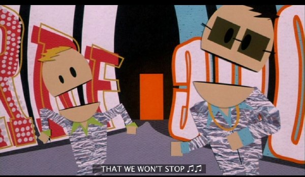
- South Park: Bigger, Longer & Uncut
- Gattaca
- Moulin Rouge
- Bend ’er Like Beckham’s Fauxhawk
- WGBH:
- Jackass: Le film
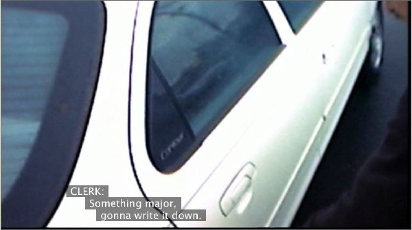
- Road to Perdition
- Unknown captioner (but probably SDI): Laurel Canyon
Reference
If this article seems familiar, that’s because it was adapted from a posting from late 2003.
Version history
- 2005.04.29
- Posted.
Navigation
You were here: Screenfont.ca → Fonts → Today’s fonts →
Problems in software rendering of Line 21 captions