What’s wrong with Arial? See for yourself
Herewith a small selection of the thousands of captions and subtitles you can find merely in the DVD format, from, in order, Black Hawk Down (subtitler unknown, but it’s probably not the captioner, Captions, Inc.); Gerry (Vitac); Japan: Memoirs of a Secret Empire (SBS).
See also: Our discussion of the history of grotesk faces like Arial and Helvetica.
-
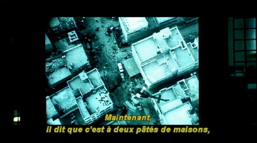
- Circumflex accent on â misrendered; jagged italics, particularly the predictable trouble spots of i, l, t; quintessential distracting point on t.
-
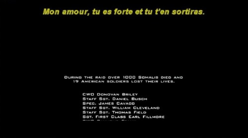
- f, t, i misrenderings and confusions (particularly in the word sortiras).
-
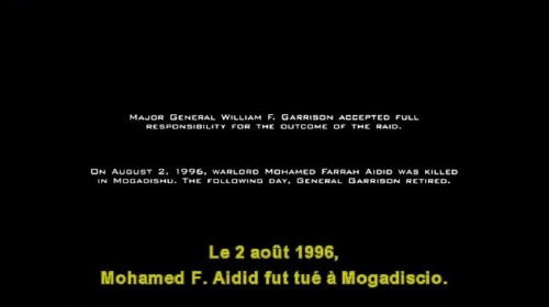
- Aidid fut tué or Aidid tut tué? Default tabular figures inappropriate for subtitle use (see the excess of space on the right side of the quintessentially ill-formed 1).
-
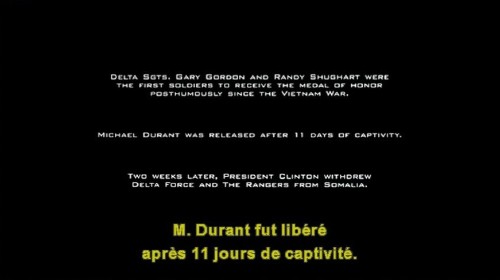
- A nice example of the inappropriateness of Arial’s t and 1 characters (again with too much space in the tabular numerals).
-
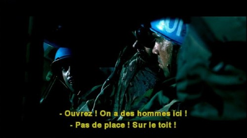
- Possibly the most maddening and asinine habit of Windows-using subtitlers: Incorrect substitution of hyphen character for en dash. We know it’s hard to type on Windows; we don’t care, because it’s wrong. Equally errant practice of typing a full word space before a French exclamation point turns this subtitle into two lines, preceded by a little smudge, of an apparent 16 words. (There are only 12.)
-
![Caption reads: We took a... [ Inhales sharply ]](http://Screenfont.CA/2005/images/smaller/Gerry_053.jpg)
- Some captioners’ incorrect practices are worsened by confusable character shapes. It seems to be a Sisyphean battle to explain to captioners that spaces do not occur inside brackets or parentheses. Since they aren’t designed for standalone use, brackets in particular look strange when sitting all alone. The worst-case scenario is of course the English language, which uses the word I rather frequently. As explained previously, a caption reading [ Inhales sharply ] ends up looking like I Inhales sharply I.
-

- There’s the problem in this case of a busy underlying image that interferes with reading. (Say what you want about the ugliness of the Line 21 and teletext black bounding boxes around captions, but you can always read white letters typeset against them.) We propose that confusable character shapes are a particular obstacle when confronted with unfamiliar words, even if they are in your own language, as in the subtitled phrase pictured: The Dutch East Indies Company sent Dr Kaempfer. (“India”? “Kamper”?)
-
- Minor additional reason not to use Arial: If the program producers are themselves too cheap or clueless to use distinct and appropriate type, then your captions blend in a bit too well. The errant (c) is an artifact of these captions’ origins in teletext, which lacks the © character. (That’s hardly an excuse.)
-

- A clear example of the resolution differences you can find even within the same display medium. DVD subpictures have the same resolution as the underlying image and can cover the same area – 720 × 478 pixels in NTSC, 729 × 573 in PAL. The difference is the paucity of colours available – for captions and subtitles, four colours in principle, two in practice. The Chyroned name and affiliation of the guest (font: Delta Jaeger) looks whiter and clearer than the Arial caption. The caption is also errantly typeset in Italic – Eiko is speaking right on camera, not off – which worsens matters through jaggies. Perennially excessive spacing around numeral 1.


![Caption reads: We took a... [ Inhales sharply ]](http://Screenfont.CA/2005/images/Gerry_053.jpg)


Version history
- 2005.04.29
- Added a discussion of the history of grotesk faces like Arial and Helvetica.
- 2005.04.14
- Posted.
Navigation
You were here: Screenfont.ca → Fonts → Today’s fonts →
What fonts should we use in the meantime? →
What’s wrong with Arial? See for yourself